


Style Notes 01|Red + Butter
Italian inspired glamour with Kate Lowman


Back in March, Kate casually mentioned how inspired she was by the color palette of my new work:
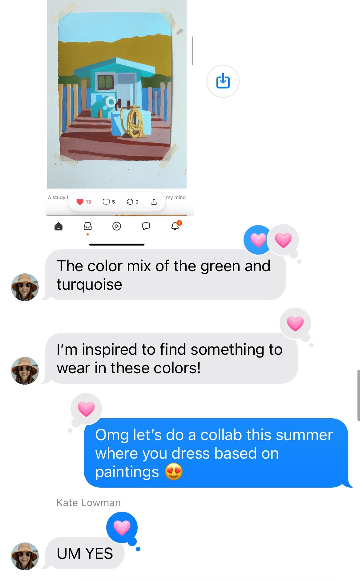
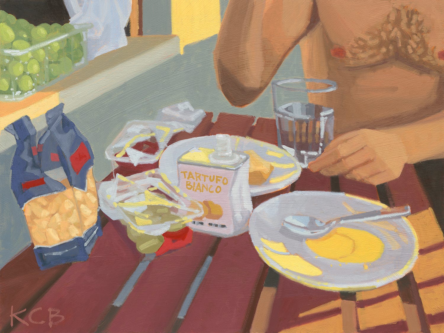
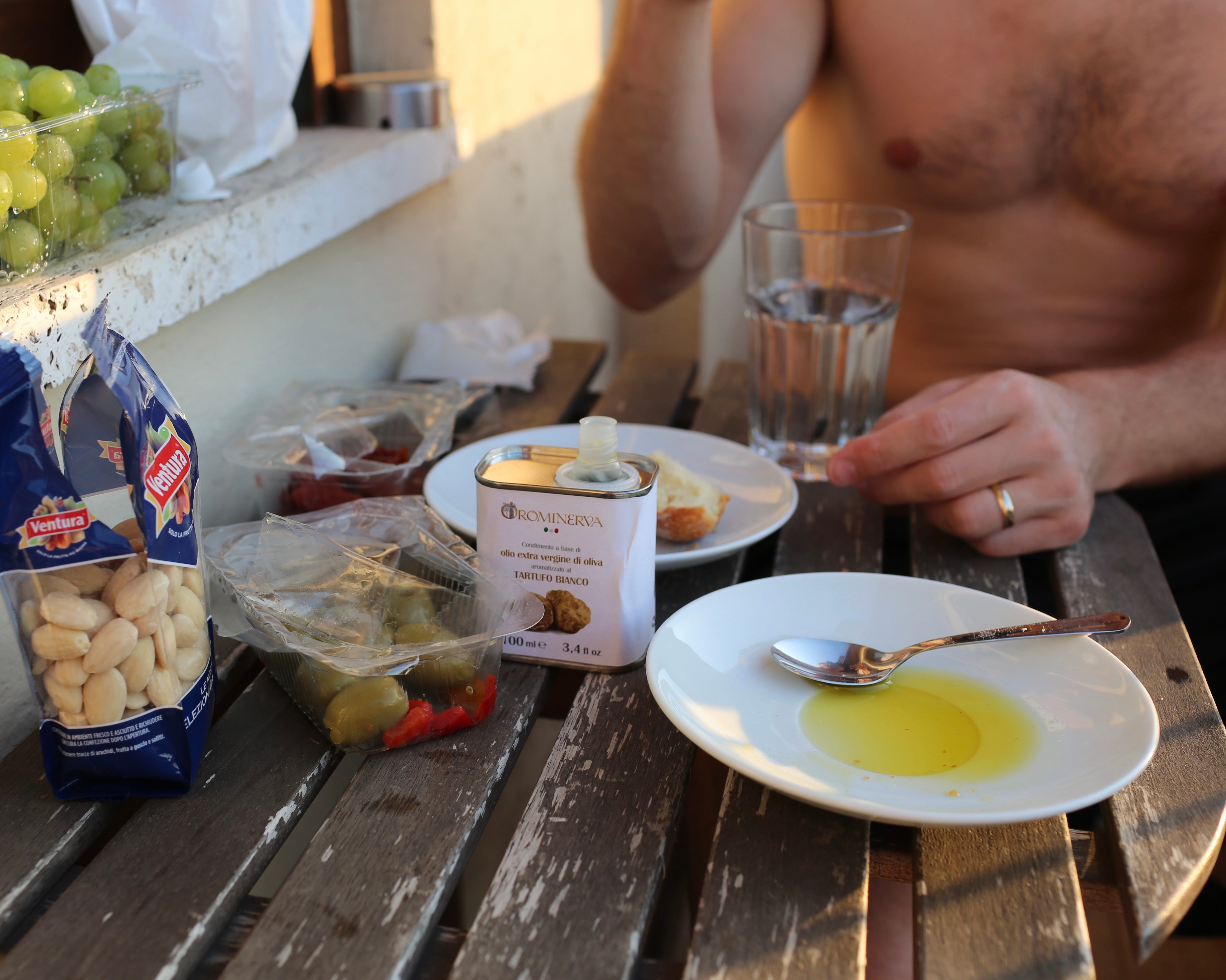
And thus, this mini series was born! Today’s post is Kate’s interpretation of ‘Aperitivo’, an 18x24 oil painting now available on my site:
For painting questions + inquiries, email hello@katherinecorden.com
For fashion questions + inquiries, keep reading!
Kate’s Notes|Aperitivo
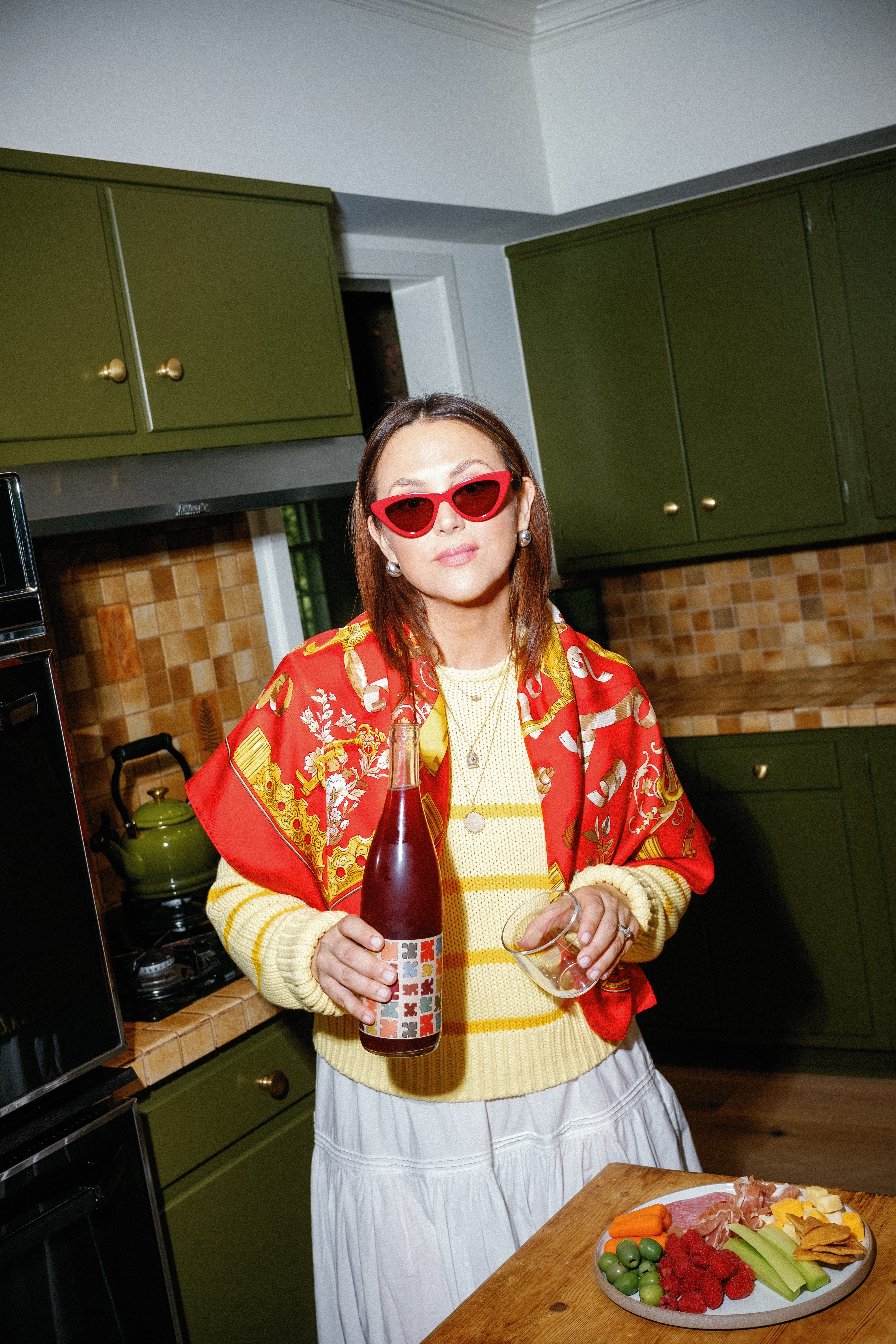
Inspired by the colors of the golden Aperitivo hour so beautifully captured by Katherine, I immediately honed in on the presence of the season’s “it” color: buttery yellow. I already scooped up this yellow sweater from La Ligne NYC, and knew I wanted this look to feature the sweater in a big way.
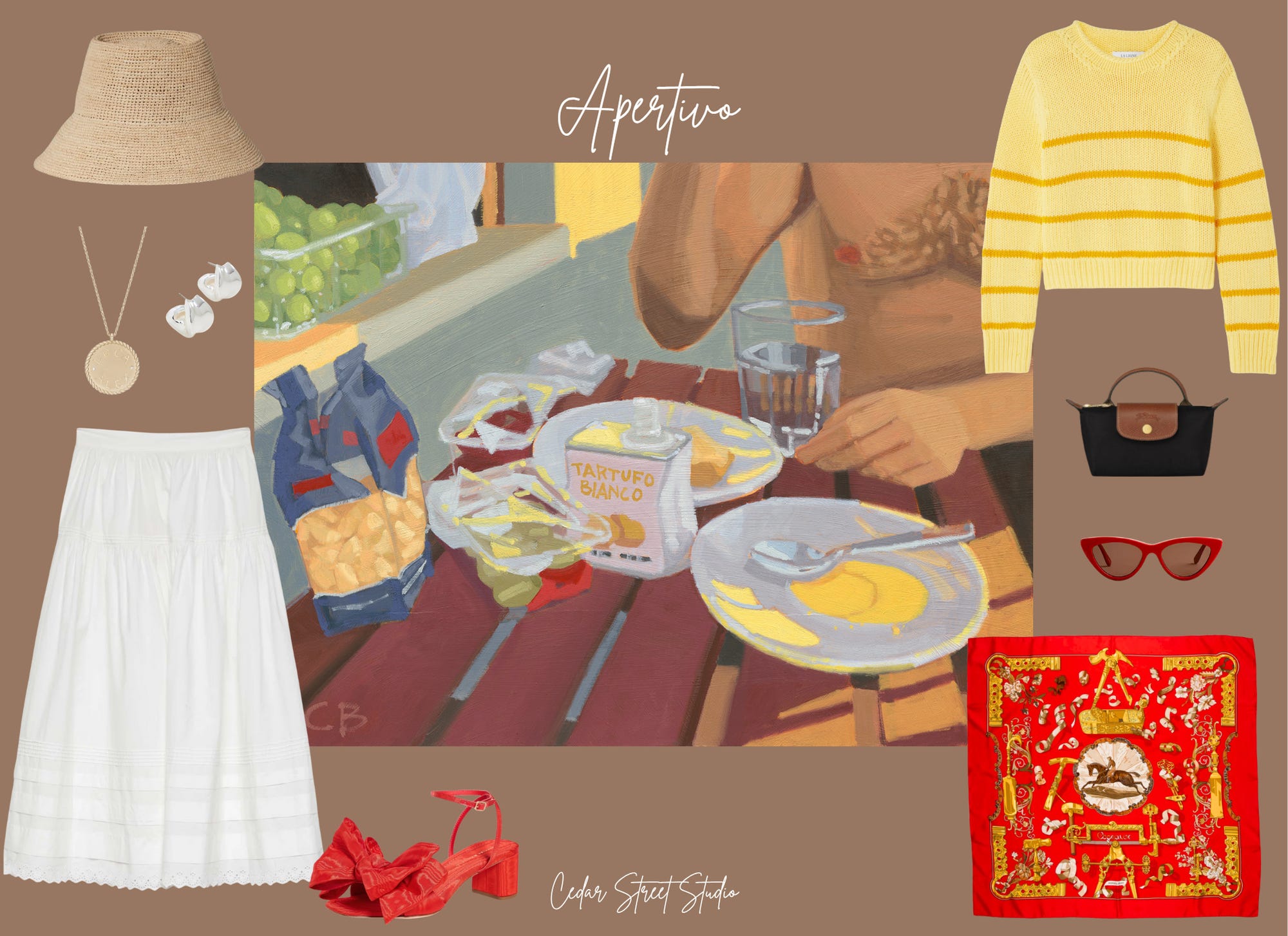
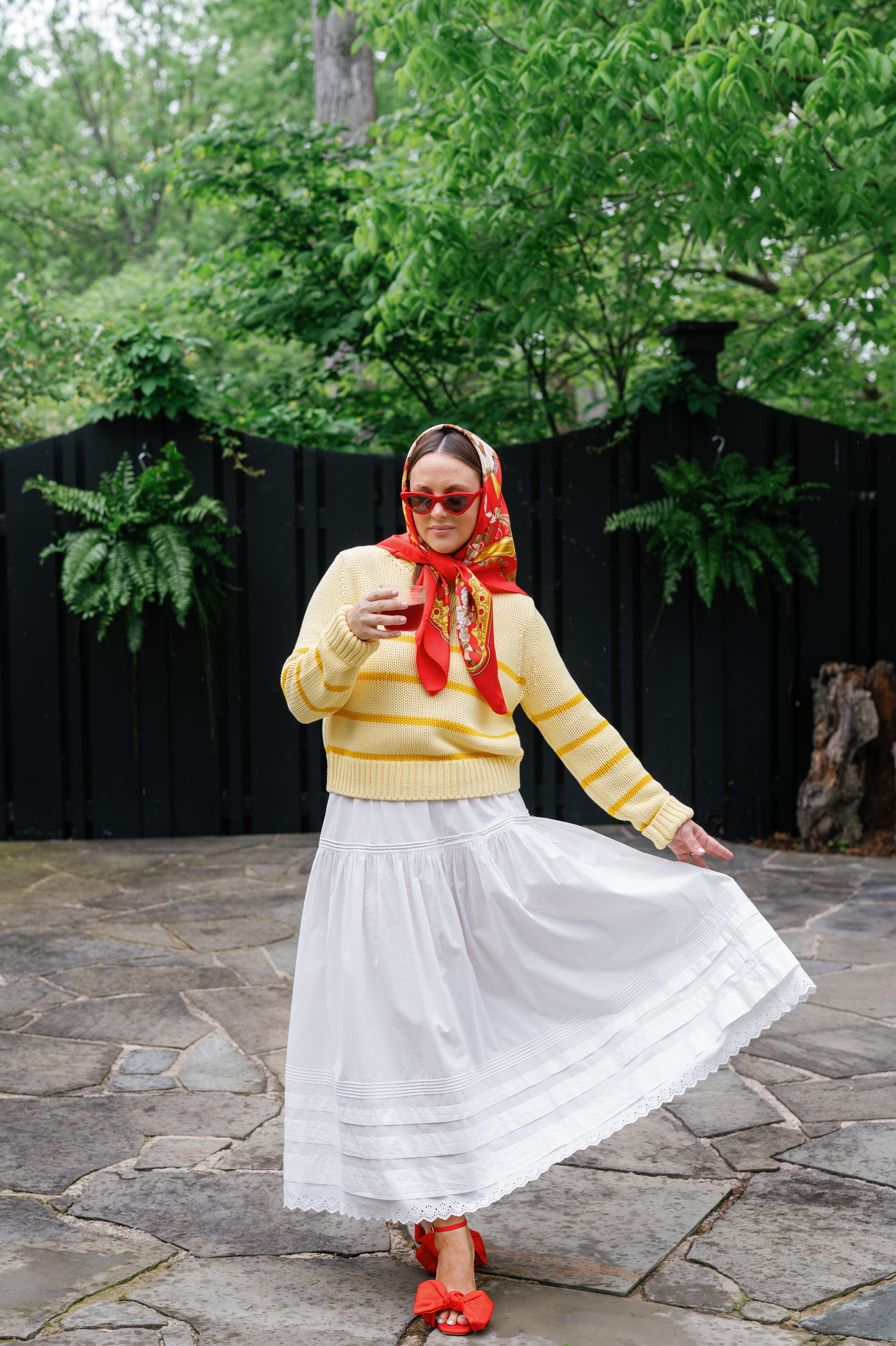
A less obvious pairing was the yellow sweater back to a white boho skirt. The Dôen Sebastian skirt is a best seller for the brand, and for good reason: the fit is impeccable. I typically avoid skirts because they don’t do much for my petite curvy frame but this was an absolute exception. The skirt is viral for a reason, and worth every penny IMHO. Honestly, I'm a bit annoyed with myself for not ordering this skirt sooner.
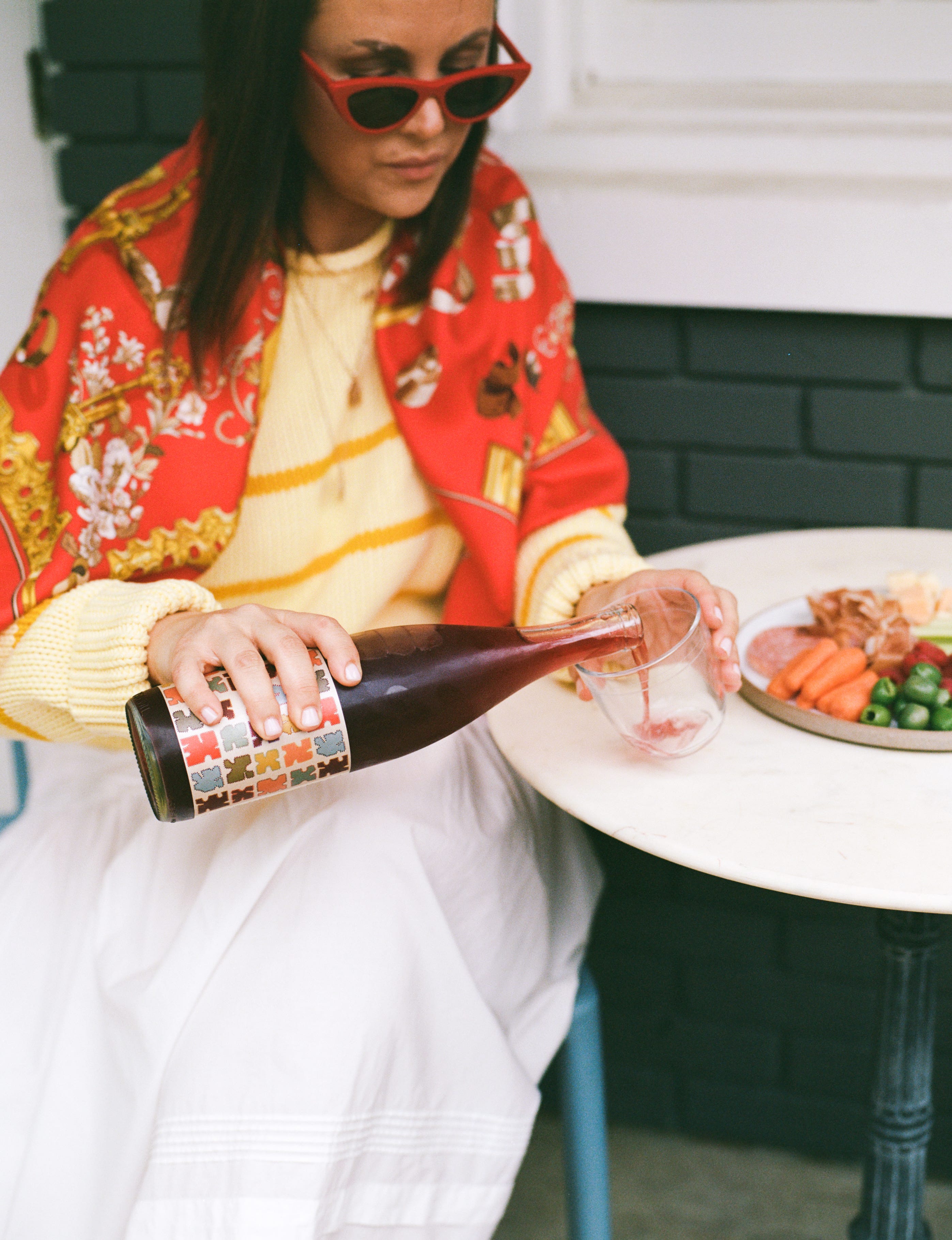
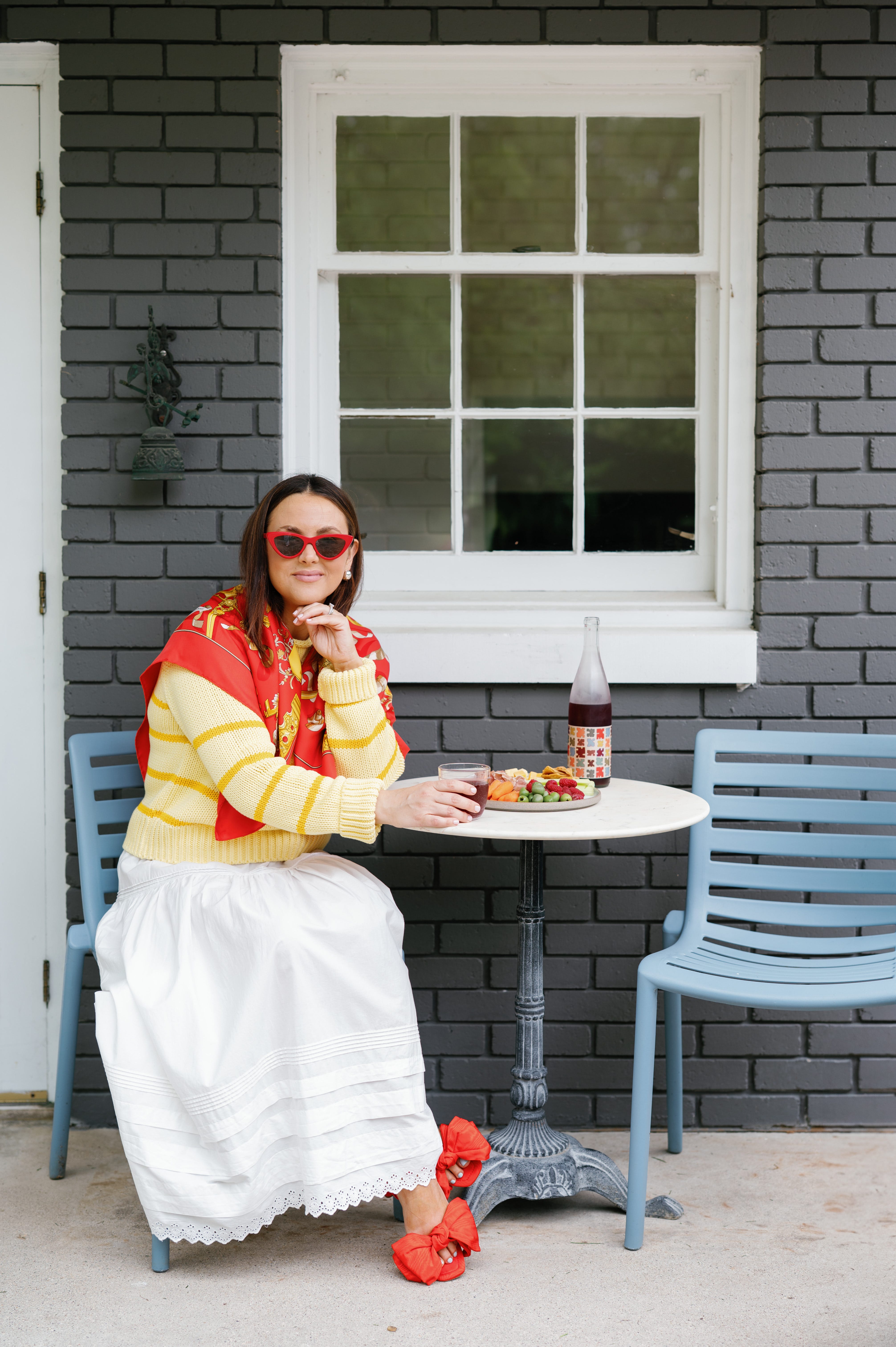
And lastly, the accessories! Inspired by the painting’s nods to Italy, I wanted my accessories to take the overall look to more of an Italian Nonna aesthetic and disrupt any prairie vibes from the skirt. The vintage Hermès scarf, sourced second hand from TheRealReal, does the trick. The red adds a much needed pop to the outfit, while giving the look an overtly Italian feel. The matching shoes and sunglasses round out the color story and bring overall cohesion.
P.S. I love a full blown matchy matchy moment in my accessories which somewhere down the line got a bad wrap. This look is my counter argument.
*The links provided are generated by Kate. She may earn an affiliate commission on any purchases at no extra cost to you.
Thanks Kate! To keep up with her (and her own upcoming Euro trip!) subscribe below:

Ummmm HOW FUN IS THIS
This is so fun! Love the last photo and the olive green cabinets!