


Style Notes 04|Wrong Shoes, Right Set
Creating tension + contrast in your composition


Welcome back to our final installment of Style Notes with stylist Kate Lowman! An experimental collaboration where we extrapolate the palette from canvas to closet.
Modify your subscription at anytime in your account settings by toggling notifications next to the sections you’re interested in.
I really enjoyed Kate’s notes for these final two studies. Her approach to creating tension and contrast in a look is so similar to creating a compelling painting. What we find visually captivating interests me endlessly! Perhaps one of the many reasons I’m so drawn to personal style.
She also told me to snag that Gap set earlier this year and I can attest it is very good. I’ve been living in it my entire pregnancy.
Take it away, Kate!
Kate’s Notes|Study 5
Printed Midi Dresses and Why Shoes Matter

My love of Dôen is clearly on display in all my looks but what I rely on the brand for most is printed maxi dresses. I always feel good in their prairie cotton dresses in the summer as they highlight my waist without feeling constrictive or hot.
I felt so inspired by Study 5’s initial simplicity but then realized while sourcing the look, it’s much more nuanced than it initially appears. The same can be said for this dress. A floral maxi dress is by no means new or innovative but done in softer tones with a stronger presence of green and yellow feels nuanced and relevant.

I talk about the importance of accessories all the time (they are what take clothes from an outfit to a look). Here is a great example of the concept. I could have easily paired the dress with a heel and called it a day but the soft blue jelly shoe and 90s inspired silver and black Ray-Ban sunglasses take it to a much funkier place. Think cool art mom (my personal goal).
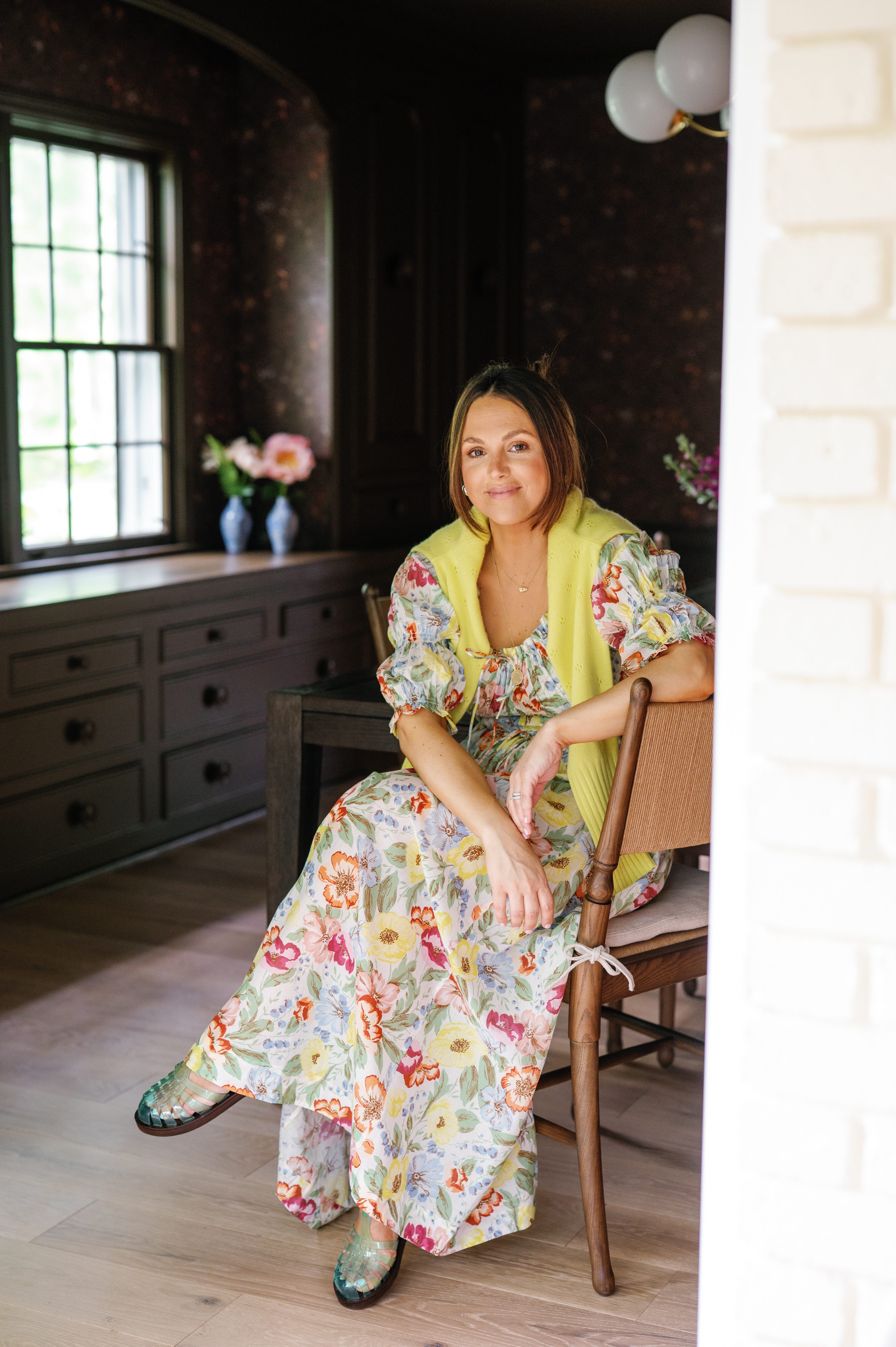
In general, shoes are a great place to purposefully pause and brainstorm a more unexpected choice. That tension will level up your style (I very much recommend watching Allison Bernstein’s Wrong Shoe Theory video online).
Kate’s Notes|Study 6
The Set Every Girl Needs for Summer

Last but certainly not least, the summer set I live in. The painting is an inverse of my look, a play on the palette, but the stripes convey the cohesion. I have a painting of my own of Katherine’s with a woman solo on the beach with a striped towel so I felt a sense of familiarity when viewing this study.
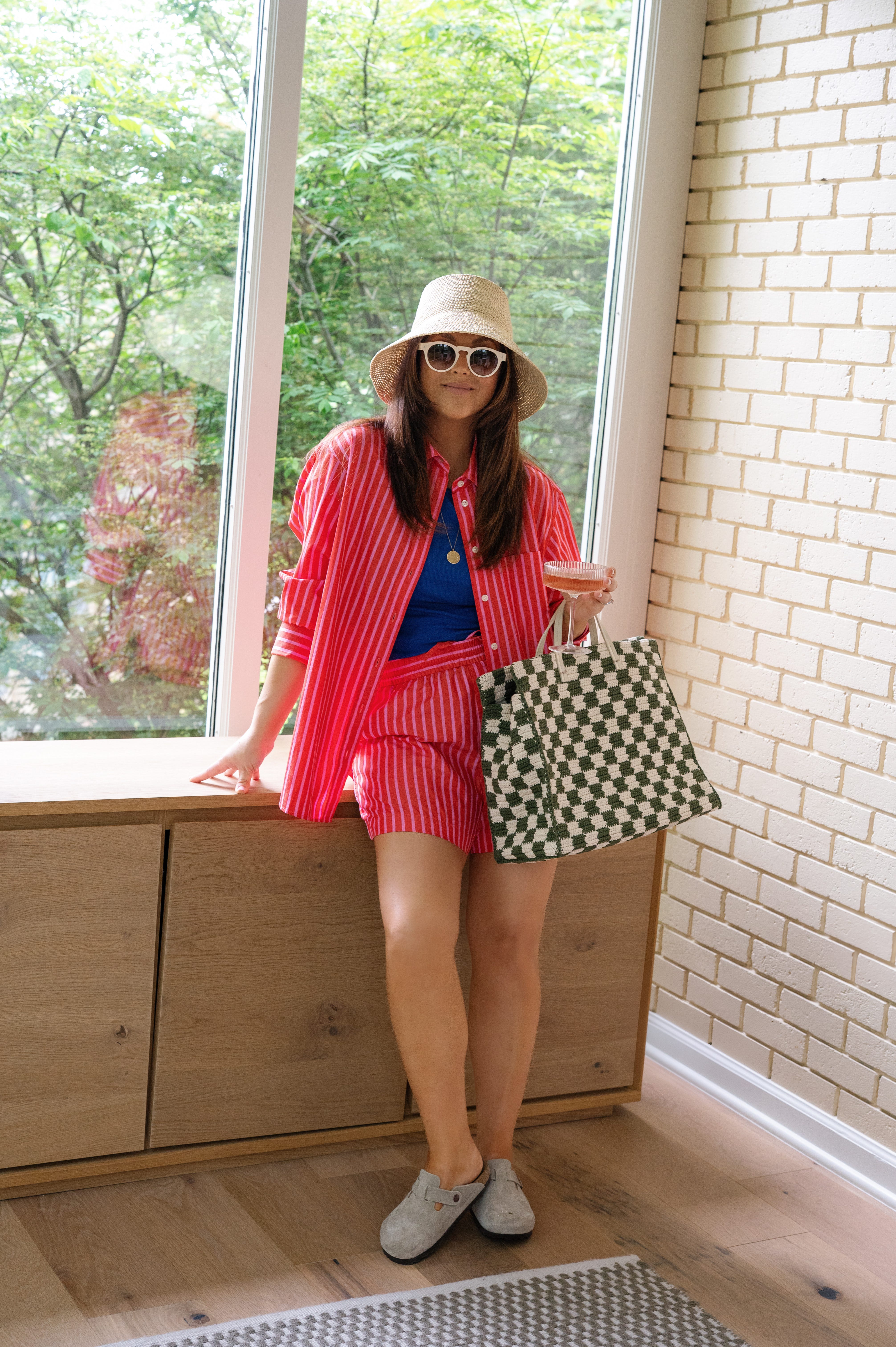
I spent all last summer living in stripes. I was in the middle of a major move, leaving my home of the last twenty years to return to my hometown with my husband, three children and dog. We found a beautiful new home but it needed a size-able renovation. We lived a transient lifestyle for the entire summer which meant my wardrobe was largely packed up. I bought a striped set from the Gap somewhat pointlessly - I hadn’t ordered anything from the Gap in years and had zero confidence it would fit let alone be something I liked.
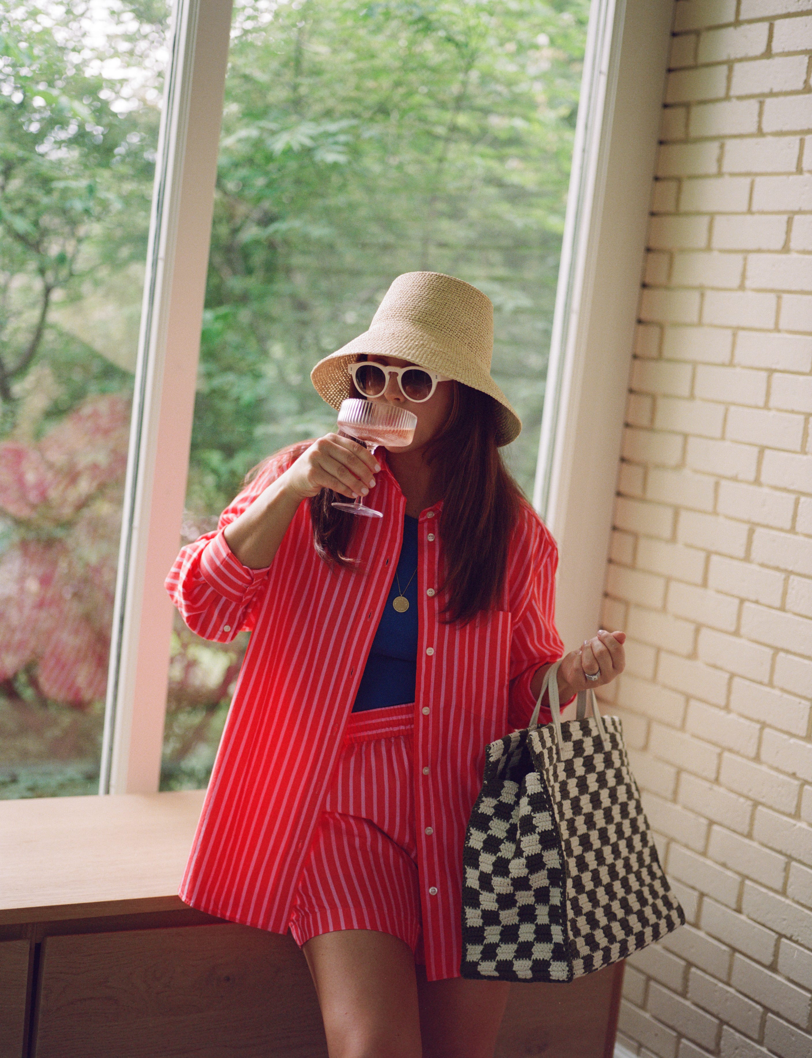
SO WRONG. Not only is the fit superb, so is the quality. I literally wore that set 3-4 days of every week of the summer. I was sad to put it away last fall because it was so easy, so stylish and so comfortable.
When I saw the brand had returned this summer with 4 to 5 new color-ways of the same set, I pounced. The red and pink is so vibrant and screams wear me at the beach. I love it paired with the cream sunglasses, natural Felix hat and simple Birkenstock clogs.
Kate’s final notes and must haves: A Chore jacket for all seasons, Janessa Leone’s Felix bucket hat, Gap’s striped poplin shirt and boxer set.
Thank you for contributing to this series, Kate! Ever since learning of the ‘wrong shoe theory’ it lives rent free in my mind. And we’ll take a good high-low mix + Gap rec any day.
And thank you for joining us at The Art Table! If you enjoyed this post, please consider liking, commenting + sharing. It really helps this newsletter and motivates me to keep sharing with you!
Loved this series - Kate & Katherine you guys are incredible!! ❤️