New work + a look into my stream of consciousness.
Calling all geometry nerds! Can you spot the triangles?
Greetings, from lilac season in northern Michigan! It’s officially, unofficial summer here, but the crowds have yet to arrive, making it particularly sweet. As I write this, I’m sitting in our library with a glistening bay taunting me, so I’ll try to keep this short! I’m here with some art updates, testing a new format (let me know your thoughts in the comments!) and as always my favorite part, Table Talk.
New Paintings
And a peak into my sketchbook/stream of consciousness notes on them. Psst… Can you spot the triangles?!
I often paint the beach - and yes I love me a beach day, but truth be told I’m most drawn to them (pun intended?) because I simply love figure painting, which beaches are chock full of! And I’m often trying to deconstruct it so it’s less about the seasonality and more about the colors, shapes and social interaction. So without further a do, a look into my scattered stream of consciousness:
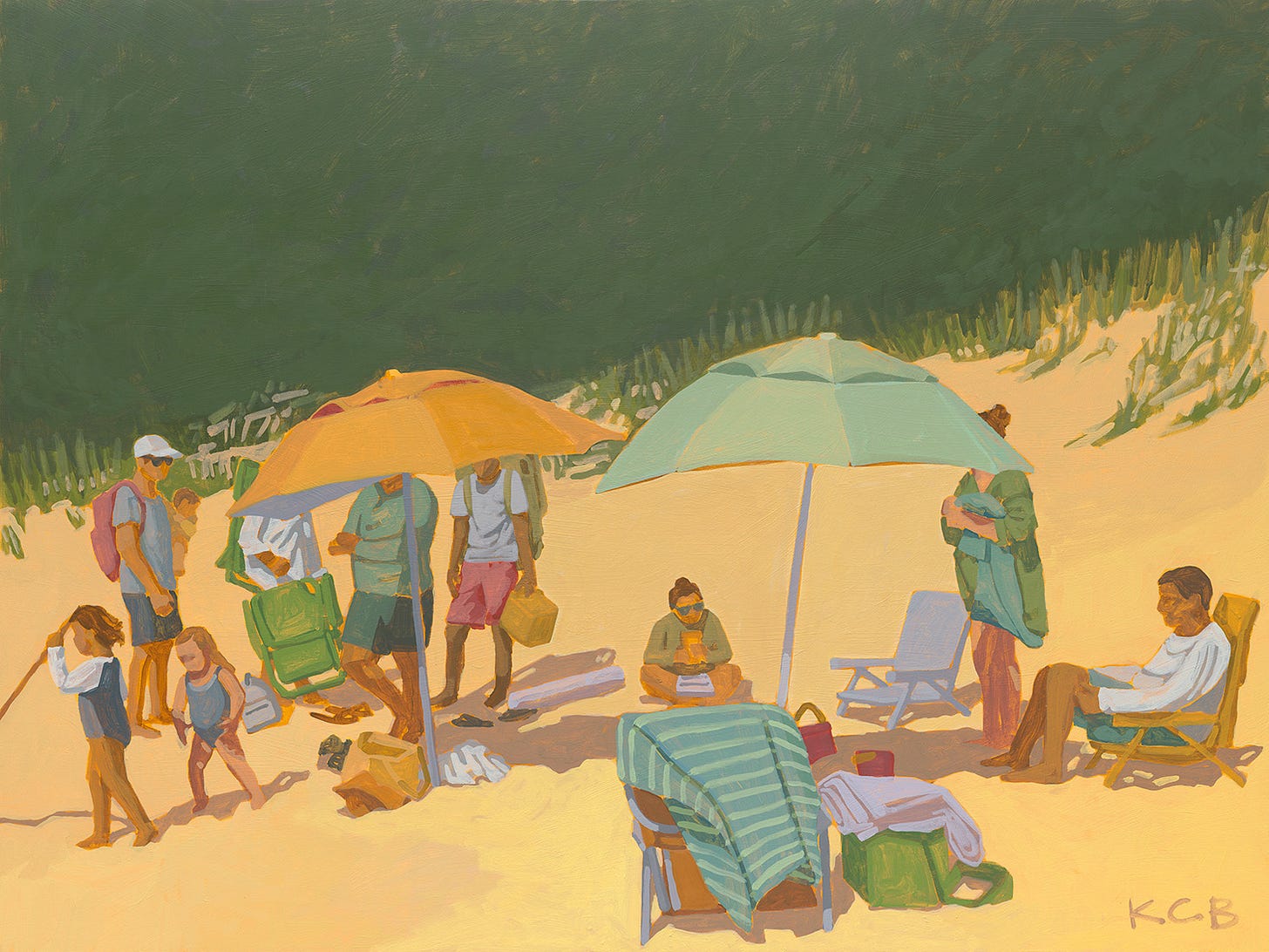
The faces are left abstract or blocked completely by the umbrellas - this leaves room for viewer participation. A common theme in my work - for the viewer to hopefully recognize themselves or someone they know.
An inverted triangle composition between the beach chair and umbrellas grounds you back into the physical world/the beach.
A second triangle is the diagonal line created by the dune, the edges of the painting and the line of people. Lots of lines to direct the eye.
When there is crowdedness in a composition, you need some place to rest the eye - the balance here is found in the solid green trees making the background.
The child’s stick she is carrying extends off the page in the left and offers just enough mystery for us to escape into the painting and wonder where she’s headed.
A limited palette keeps the figures and objects cohesive and not busy or cluttered.
The smaller scale of these figures was so fun to paint. One brush stroke for a limb = so satisfying.
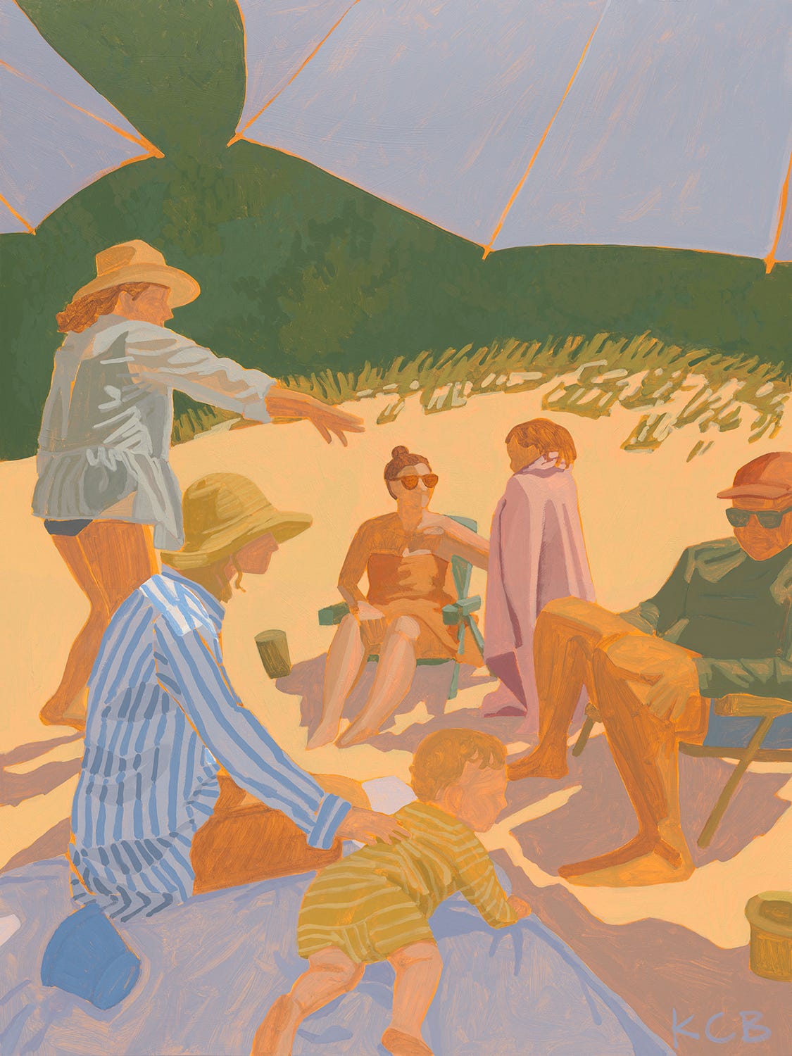
Triangles found in this composition offer balance, simplicity and connection. Can you spot them all?
The light value of the sand is strategically used to emphasize the figures in shadow.
Painted from a perspective to invite the viewer to escape into the scene as a participant.
The shaded indigo umbrellas match the shaded beach blanket and help enclose the figures, offering a sense of safety and comfort.
A common theme in my work but emphasized here - shapes and colors simplified to three values - dark, medium and light - and simple shapes. A color study as much as it is a figurative painting. The simple colors and shapes offer a modern take. Further explore this theme one day using collage and/or screen printing techniques.
A favorite moment - the sheer cover-up, top left. I’ve been tempted to recreate this in current WIPs but might be forcing it.
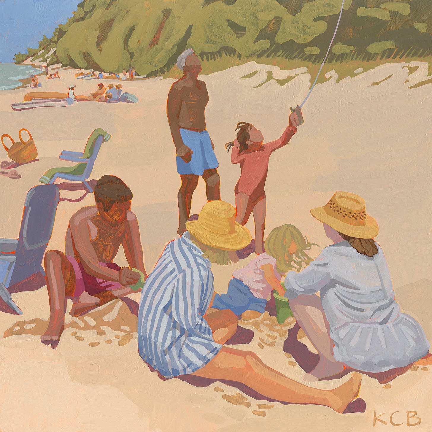
A very obvious triangle - the wide base suggesting stability - the upward point carries us to an imaginary place in the sky, joining the invisible kite.
A challenging but fun exploration of colors found in the sand. Up close there is wet sand resulting from digging, some in shadow, some not. And in the background, an attempt to bend the color of the full sun beach, but not the value.
The little dots and suggestions of figures in the distance, again very satisfying, and a fun area to explore when returning to the painting.
Another working title for this was ‘high noon’ but the seltzer has unfortunately ruined that for me.
V Gallery
Opening Night: Friday 5/24 | 4-7 PM | 5039 N West Bay Shore Dr, Omena
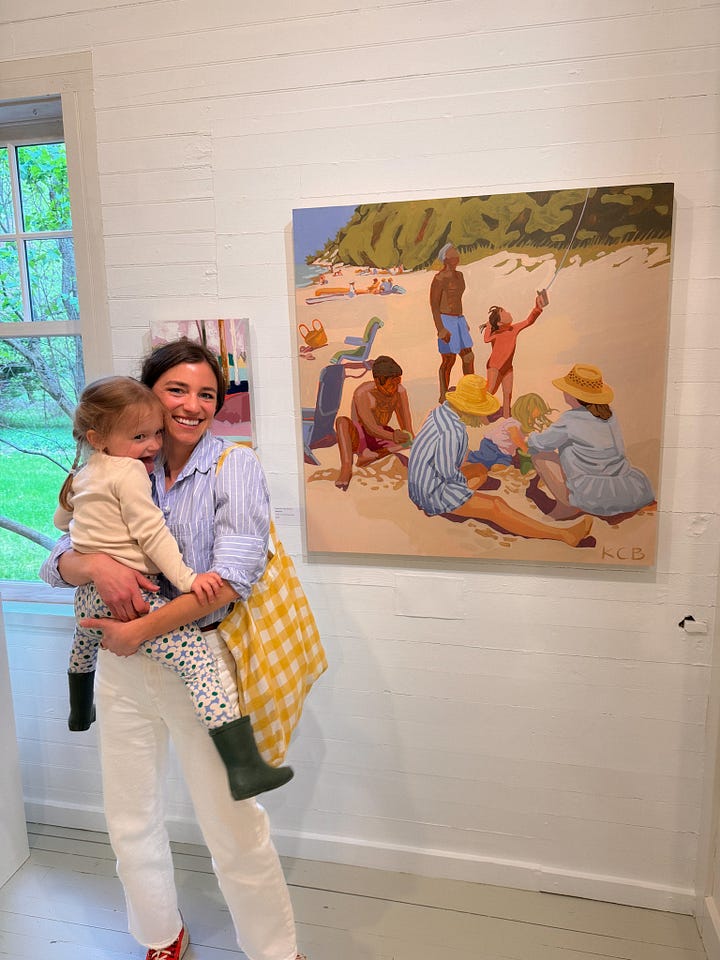

Our friends and neighbors Matt and Hillary Voight are officially opening the doors of their new V Gallery this Friday, 5/24 from 4-7 pm! I’m honored to be included among their fabulous line up of artists. A must see when you find yourself up north this summer.
Table Talk
Aka the convos I’d be having with you while sitting together, making art.
If you’ve been with me for awhile, you know I’m a big fan of Doen and the sisters behind the brand but I also love a good hi-low mix. I know genZ has it trending at the moment which makes me feel particularly old, but I grew up in GAP head to toe and have been nostalgic for the 90s ever since. All that to say the aforementioned brands launched a very buzzy collab this past Friday. (If you’re a fashion follower this is very old news by now) but FWIW these are my faves of what’s left:
This Skirt - sadly sold out in my size (I have been coveting the pricy Doen version and really wanted to snag this one), but available in L and XL. I’d wear with colorful sneakers and a boxy tee or sweatshirt (see below) to balance it out.
This Dress looks like it was fully re-stocked - for good reason!
I’m tempted to get this tank / skirt set and the matching kids dress for Clara.
One can never have enough pointelle and I love the colors these come in.
I also think this red kids sweatshirt is so fun. Order a L or XL for a boxy adult fit!
What are your faves?! I’m crossing my fingers for another re-stock.
I’ve been playing the part of lead designer for our home restoration (one of the many reasons you haven’t heard from me lately) but I’ve really been enjoying Ariel Okin’s podcast Shop Talk. She’s a great conversationalist and has such an impressive guest line up! Admittedly, I’m all caught up.
This Love and Lemon’s pasta salad has become a warm weather staple in our house. It’s easy, healthy and delicious and you probably have the ingredients handy or could swap anything you’re missing. We made it last night for our first porch dinner of the season!
Finally - I’m going to try block printing soon for a personal project! Artists - if you have any tips on fave materials please share in the comments!
Alright, that’s all for now. If you have any questions or just want to say hello, liking this post and sharing a comment really help my newsletter! I’m also always available via email.
Thank you for being here,
x
Katherine


